Did you miss us? Okay, let’s not get too sentimental… let me try again.
Did you miss our personalization series?
We're back after the Christmas break with the fifth article, just like we promised.
In our last chat, we got hands-on, moving from talking about website personalization to showing you a real example – the Acme Lease case - in order to share how an adaptive website can create unique user experiences. The Acme Lease case demonstrated how Ellen and Otto’s distinct experiences influenced them to request a quote.
So, after showing a real case, it’s time to roll up our sleeves and get to work. But… where do we start? What are the first steps to do when building an adaptive website?
The Adaptive Website Blueprint
I get it, starting out can be as confusing as assembling an IKEA cabinet. You open the box and there are screws, pieces, and mysterious gadgets with names you've never heard – including the furniture piece you just ordered. Try pronouncing it correctly… STJÄRNBILD, ÖRFJÄLL, KRYDDNEJLIKA…whatever, I never can.

But here's the great part – just like Ikea gives a clear instruction manual making assembly a piece of cake, we're doing the same for you when building adaptive websites. Allow me to introduce the Adaptive Website Blueprint.
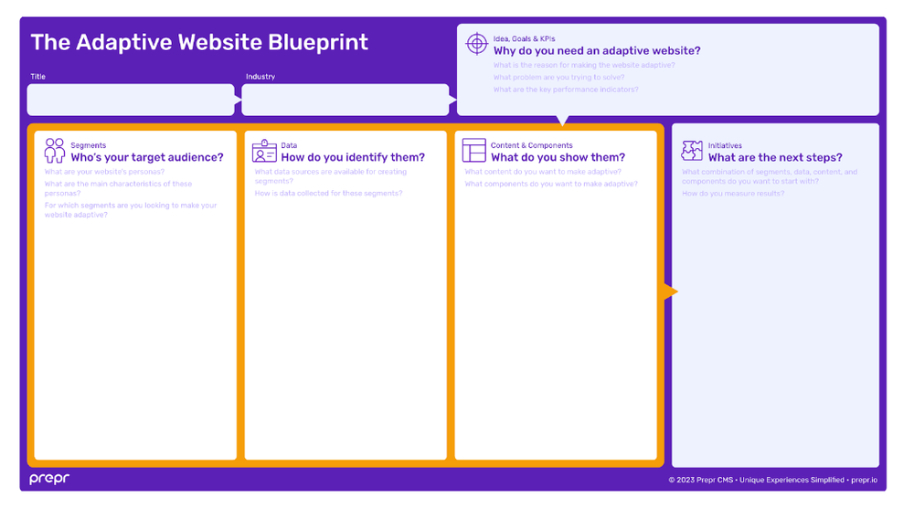
The Adaptive Website Blueprint is a helpful tool for discussing everything your team needs to cover to make your website adaptive. It is organized into sections, each focusing on specific elements crucial for building your website.
Let's now take a closer look at these sections to help you understand how the Blueprint is set up. We'll provide brief explanations so you can quickly get an overview of each aspect.
Why do you need an adaptive website?
Apart from your personal information - Title and Industry - the opening section of our Adaptive Website Blueprint is a nice light purple box called "Ideas, Goals, and KPIs.” This marks our very first step. Before you move on to the other parts, just fill in this box. It’s the space where you state the reasons WHY you want to make an adaptive website. Consider it your launching pad.
Who’s your target audience?
Just below the box about ideas, goals, and KPIs, the different columns or sections come into play. First, we’ve got "Segments." Who is your target audience? Here, you need to analyze and figure out who you want to personalize your website for. Identify the specific groups you want to target and understand the key characteristics of your visitors.
How do you identify them?
Moving to the second section, we have "Data." Here, you identify available data sources for creating segments and how this data is collected. Keep in mind, that data is crucial for creating personalized experiences. Do you remember what the British mathematician Clive Humby said, Data is the new oil? Companies use it to tailor content directly to each customer's interests and needs.
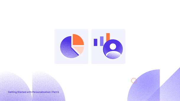
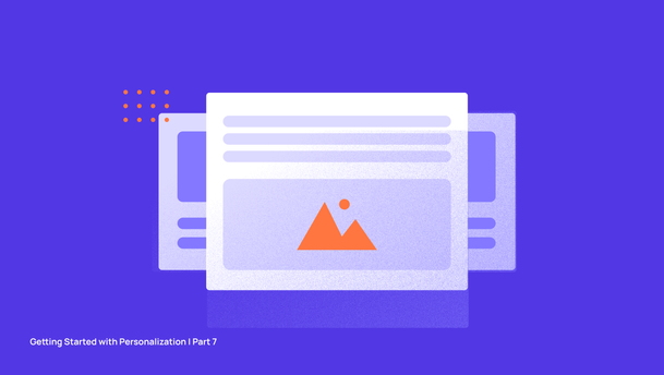
What do you show to them?
In the "Contents and Components" part of the blueprint, you get to say what content and features should be adapted for each segment. Decide which content is really important for your business to reach its goals.
What are the next steps?
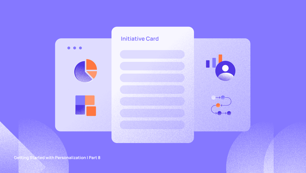
The final part is “Initiatives.” Initiatives are the projects and tasks to turn your blueprint into real results. An initiative is like putting together the elements from your blueprint to make doable tasks, breaking the work into manageable chunks.
Ideas, Goals & KPIs - Why do you need an Adaptive Website?
To complete this section, you and your team should carefully consider the problems that the adaptive website aims to address and the business goals it intends to achieve.
Building an adaptive website can be motivated by various factors, such as addressing key pain points like a poor customer experience or a high bounce rate on the current website. Alternatively, the motivation might come from a desire to expand the business and increase engagement.
As the saying goes, "If you can't measure it, you can't improve it." While it might simplify things a bit, it emphasizes the importance of measuring progress toward goals to understand what's working, what can be optimized, where growth is possible, and what steps to take next. That’s why pinpointing the specific Key Performance Indicators (KPIs) you want to enhance is fundamental. Setting KPIs is a strategic approach to guide, measure, and improve performance, contributing to the overall success and growth of your business.
Macro conversions signify your primary business goals. Depending on the website type, these goals could involve actions like purchases or adding products to the cart for e-commerce sites and clicks on affiliate links, ebook downloads, or newsletter subscriptions for other sites.
On the other hand, micro-conversions are the intermediate steps visitors take before reaching a main business goal. While various types of micro-conversions exist, focusing on improving interaction micro-conversions provides insights into visitor behavior on the site.

Here are some examples of reasons, goals, and KPIs that companies might aim for. Once you've got a clear picture in your mind, you can jot down your main goals in the first section of the blueprint. To keep things consistent, let's continue using the example of Acme Lease.

Well, dear readers, as Miss Caroline Bingley declared in the timeless words of Jane Austen's Pride and Prejudice, "I declare after all there is no enjoyment like reading!" How can I blame you, Caroline?
But time is flying; and while we'd love to chat all day, it's only fair to give each section the time it deserves. This gives you a chance to really absorb everything thoroughly. In the next article, we'll focus on the first two sections about segments and data, and later, we'll discuss content, components, and initiatives. So, I can promise another delightful reading session next Tuesday, January 16, my friends. Until then!

Getting started with Personalization
Now, are you ready to dive into Personalization? Starting your journey to personalize your website is easier than you think. If you're keen on the benefits of segment-based personalization, check out The Complete Guide to Getting Started with Personalization. You will learn how to create a personalized website with adaptive content that meets your visitors’ needs while boosting conversion by 30% or more.