Two websites with A/B testing from the start
To effectively address these challenges, Vitalis partners with Good News to come up with a holistic solution, two new websites with A/B testing.
New websites for the elderly and jobseekers
Good News developed an integrated solution that allowed Vitalis to manage content across two distinct yet interconnected sites: a corporate website targeting elderly clients and a jobseekers site focused on recruitment.
To power these websites Good News chose Prepr CMS for a headless CMS solution that includes optimization features like personalization and A/B testing. Let's take a close look at each of the websites.
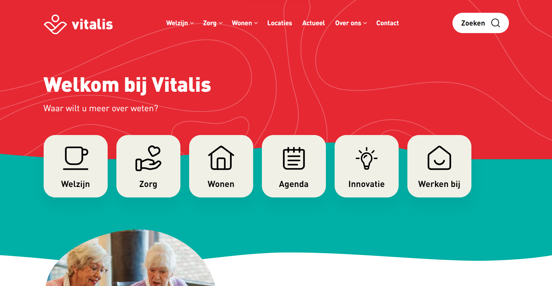
- Vitalis Corporate: This site is built for their largest audience—elderly customers and caregivers. It's designed to be accessible with large fonts, simple navigation, contrasting colors, and a mobile-friendly version tailored for seniors. The platform empowers older adults to confidently navigate the website, find information, and access assistance.
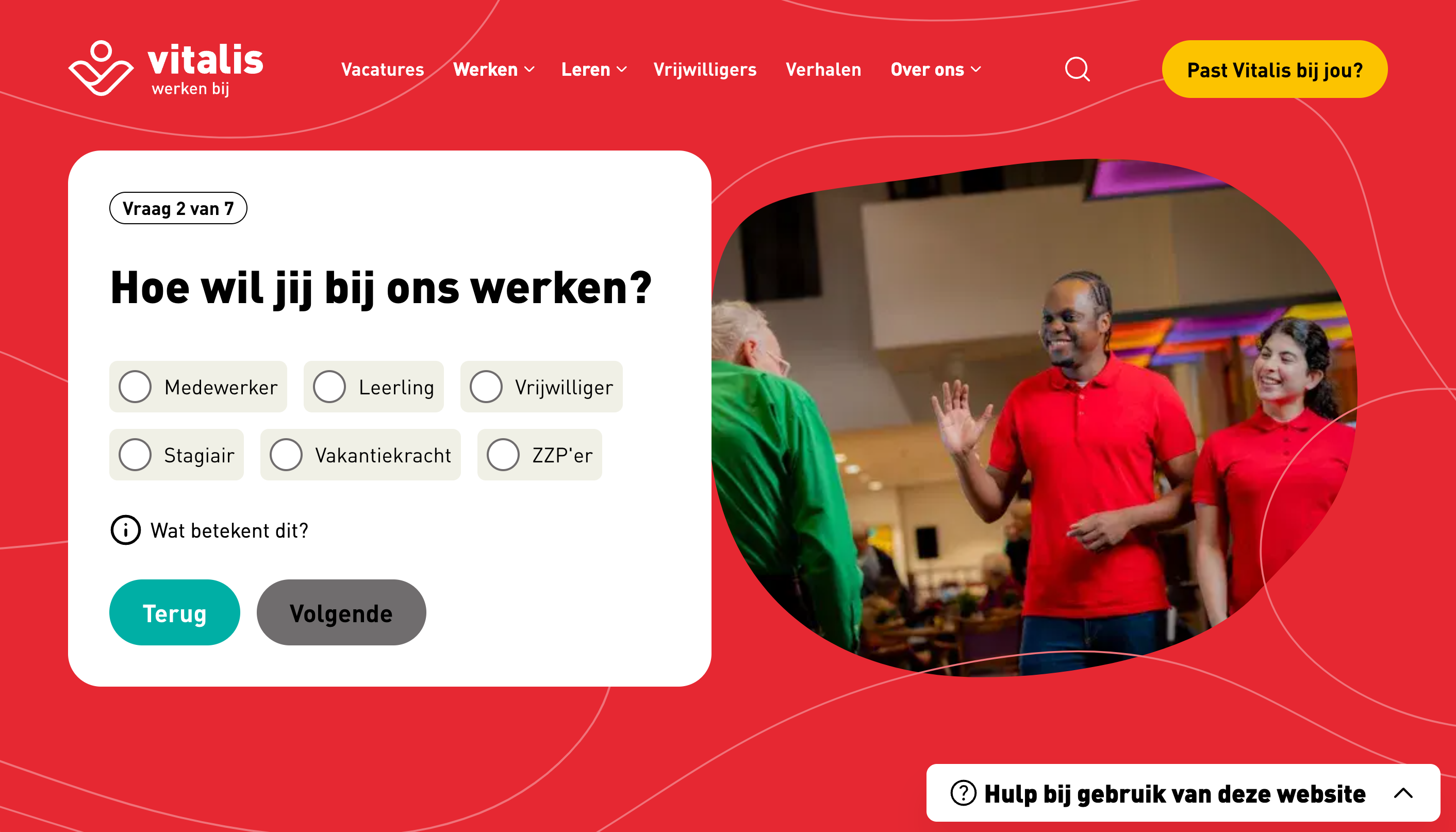
- Vitalis Jobseekers (Werkenbij): The jobseekers site employs Prepr CMS’s segments feature to match candidates with relevant job openings. Job seekers fill out preferences in a questionnaire, and the site filters vacancies that best aligns with their skills. Additionally, the platform allows for multiple job applications in a single submission, streamlining the hiring process.
A/B Testing capabilities included from the start
Other than the website implementation, Vitalis needed to ensure the jobseekers website is appealing to prospective job candidates. By using the built-in A/B testing features in Prepr CMS from the start, Vitalis can optimize the Werkenbij site easily without sacrificing performance. They run A/B testing experiments on key pages to see which version drives higher conversions.
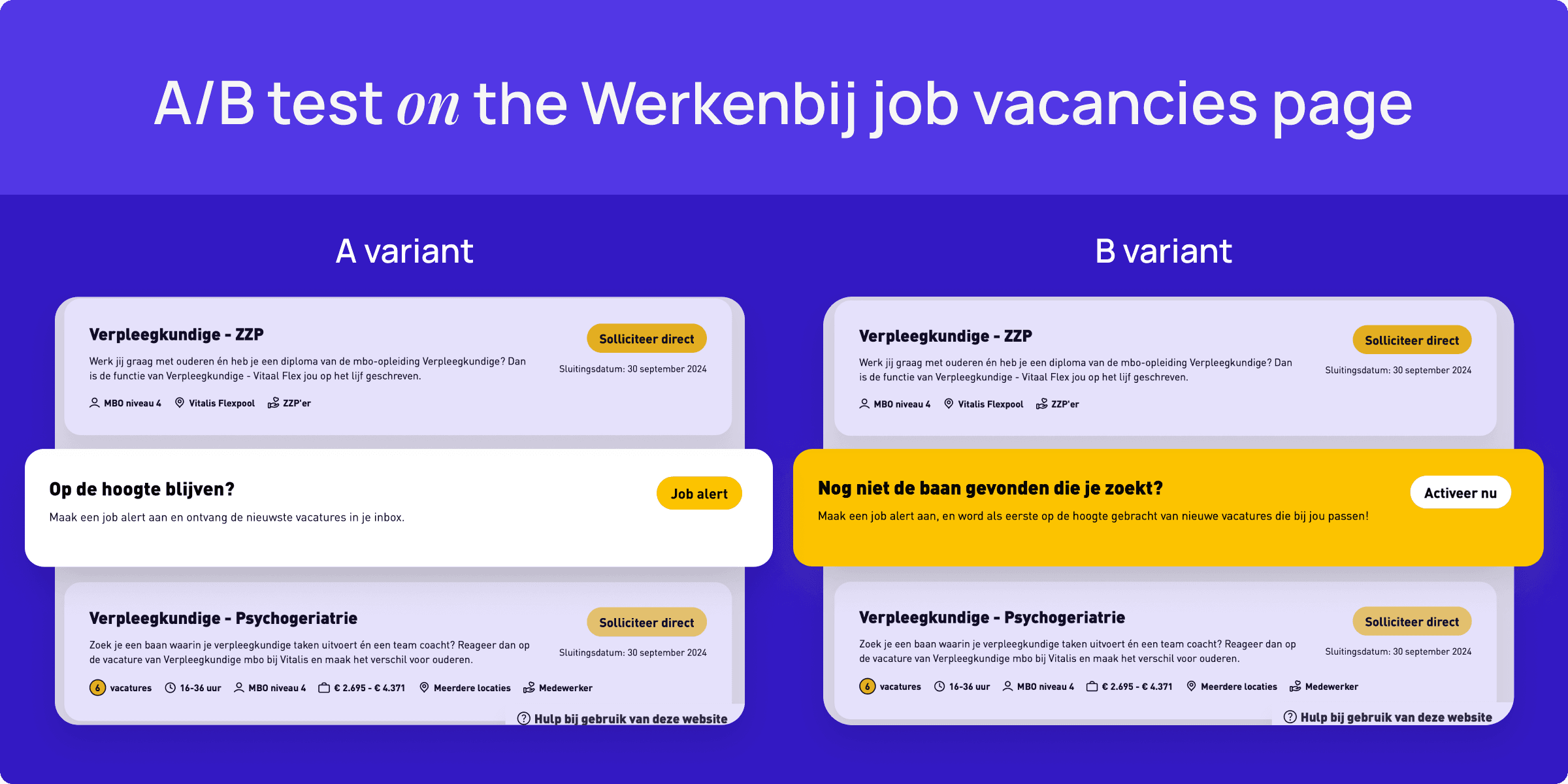
For example, let’s examine the A/B test conducted on the job vacancies page. This test aimed to encourage engagement through two different job alert banners.
By analyzing real-time metrics data directly in Prepr, the Vitalis team can compare the interactions on these two versions of the banner, and can easily identify which version performs better in driving job applications. In this case, the B-variant achieved a remarkable 230% increase in click-through rate (CTR).
Having quick access to these metrics in a single view means they can make informed, data-driven decisions to enhance the overall user experience.


